
I faced off the AI prototyping tools, and added the winner to my bundle
For one $150 annual subscription, you now get Bolt, Arize, Reforge Build, and 6 more AI tools free
$400M ARR at Lovable. $9 billion valuation at Replit. An $80M solo-founder exit at Base44. AI prototyping went from “interesting experiment” to perhaps the the most interesting category in software recently.
I’ve spent the last year inside this space. I interviewed the CEO of Bolt, the CPO of v0, the co-founder of Wix, the CEO of Magic Patterns, as well as Sachin Rekhi who teaches this at Reforge. I ran live bakeoffs on the podcast. I built my cohort business entirely on one of these tools.
This week, I wanted to assess the latest state of the market of these tools. So, I ran a real head-to-head bakeoff on two workflows: AI prototyping a product feature, and building a PM portfolio.
In today’s post, I’m going to share everything I’ve learned: a real head-to-head bakeoff with screenshots, the verified feature comparison, and the 5 workflows that make any tool work better.
But first, some news.
Bolt.new is Now in my Bundle 🎉
I just added Bolt.new to my bundle. We have 2,000 codes. Bolt will decide whether to add more based on performance. If you want one, claim it now.
I built landpmjob.com on Bolt. It runs the entire cohort business.
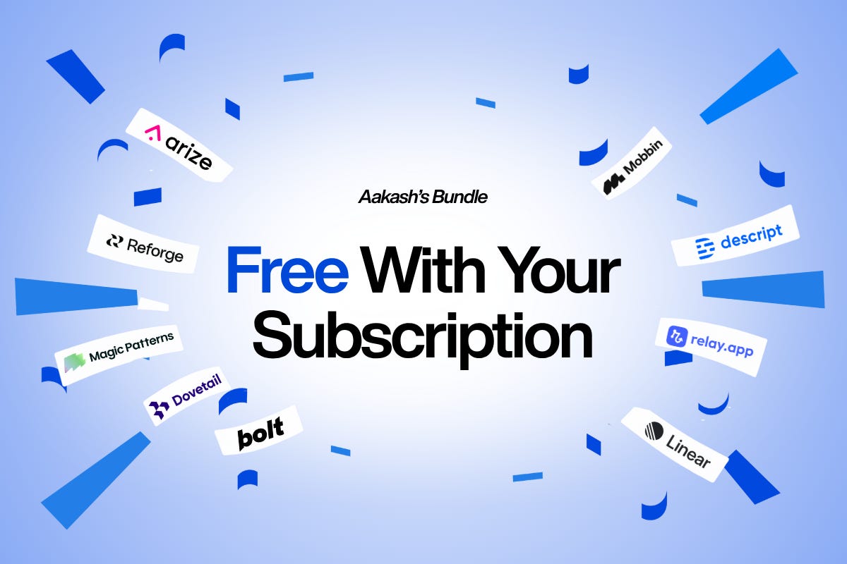
All the tools in my bundle retail for a total of $28,000+ combined. Annual subscribers get them all for $150/year. That’s less than $13/month for the newsletter plus every tool.
If you’re on a monthly plan, you’re paying $180/year for just the newsletter. Annual subscribers pay $150 and get every tool in the bundle: Arize, Reforge Build, Magic Patterns, Dovetail, Bolt, Mobbin, Descript, Relay.app, and Linear.
Founding members get three digital products on top: the PM OS, the Job Search OS, and the Prompt Library. Those retail for $147 combined. The founding upgrade is $100.
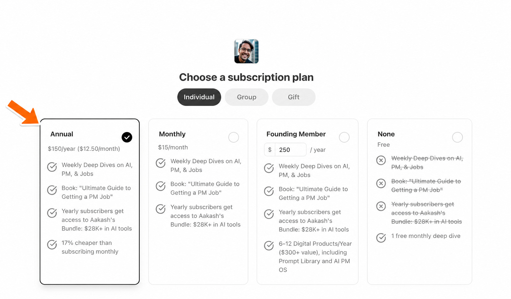
How to Get the Bundle
If you are not subscribed, you can head to the subscribe page and choose the annual plan:
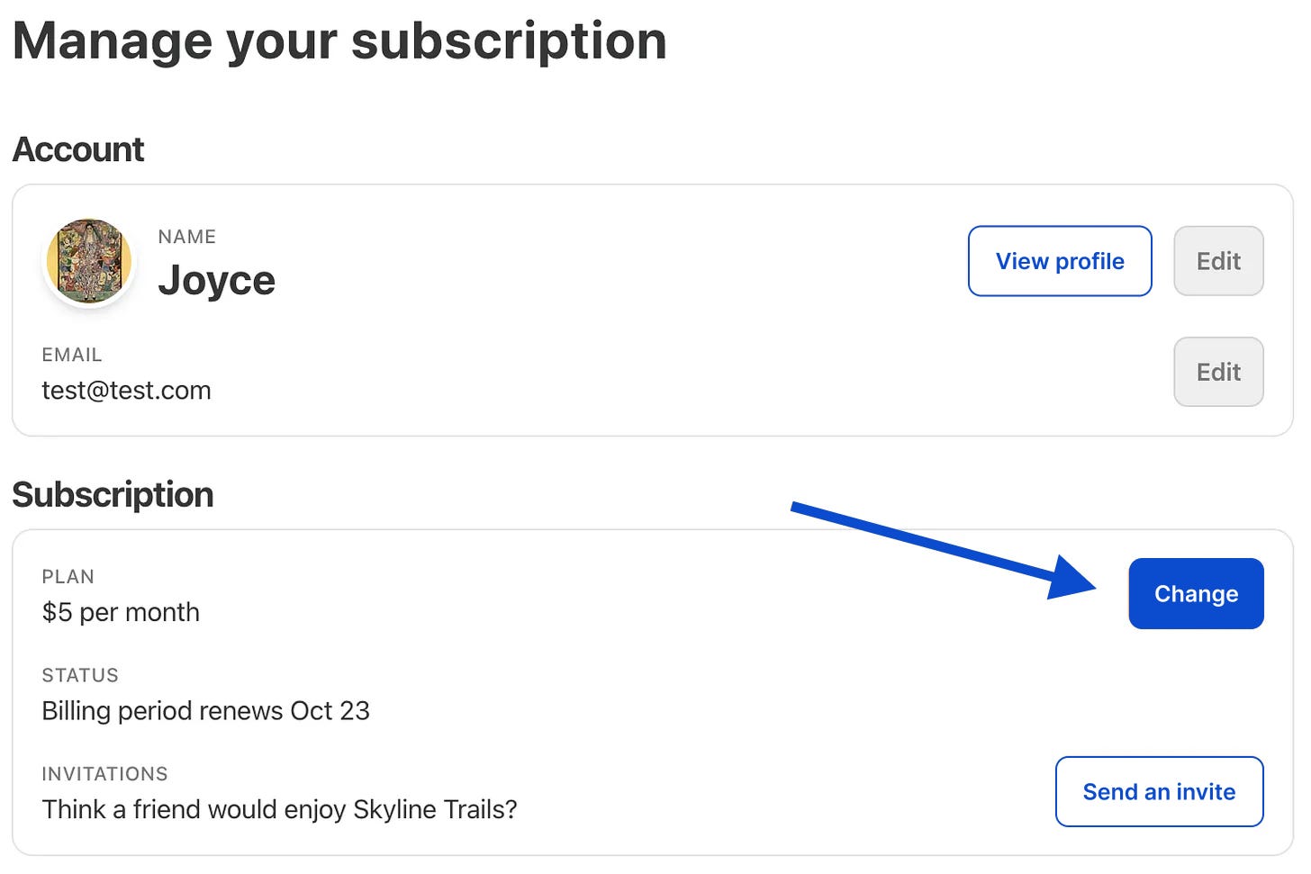
If you are a monthly subscriber, you can head to the account page, then hit change:
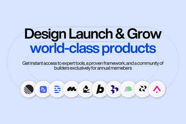
Annual and founding members get access to every tool in the bundle. Just go to bundle.aakashg.com to claim your codes:
I want to add more tools! Reply to this email if you have a tool you think should be in the bundle.
Now, Today’s Deep Dive
The landscape has changed dramatically since I wrote my original AI prototyping guide with Colin Matthews in March of last year:
Lovable 24x’d its ARR to $400M.
Replit tripled its valuation to $9B.
Vercel announced a $9.3B valuation itelf.
So I re-ran the comparison from scratch: Bolt.new vs Lovable vs Replit vs v0. Real bakeoff, real screenshots, updated feature data.
Then, I pulled together what I learned from 8 podcast conversations with the builders behind these tools into the workflows and mistakes that make any tool work better.
Today’s Post
What comes together is the ultimate guide to AI Prototyping tools in May 2026 (where most other content on the web is outdated):
The Bakeoff: Lovable v Replit v Bolt.new v v0
The 5 Expert Workflows That Make Any Tool Work Better
Which Workflow + Which Tool for Your Situation
The 5 Mistakes That Turn Good Tools Into Slop
Downloadable AI Prototyping Skill File
1. The Bakeoff
Let’s review the state of the AI prototyping market these days. Then we’ll run the top tools through a bakeoff.
The Market Right Now
The numbers tell the story of how fast this space moves.
Lovable is the revenue leader at $400M ARR as of February 2026, up from $100M just eight months earlier. Valued at $6.6B after a $330M Series B. 8 million users. 146 employees. That’s $2.7M in revenue per employee, roughly seven times the SaaS industry benchmark.
Replit raised $400M at a $9B valuation in March 2026, tripling from $3B just six months prior. 50M+ users. $240M revenue in 2025 with a target of $1B by end of 2026. The company has shifted hard toward non-technical users with Agent 4, which runs 10x faster than its predecessor.
Bolt hit $40M ARR in 5 months on a $700M valuation and was profitable. 5M+ registered users. The browser-native WebContainers technology (no VM spin-up) is a genuine technical difference for speed. Eric Simons, the CEO, told me on the podcast this architecture is why Bolt feels faster than everything else.
v0 by Vercel now has 4M+ users as of February 2026. Vercel raised a $300M Series F at a $9.3B valuation. The February 2026 update added Git integration, a full code editor, and database connectivity, moving v0 from a prototyping tool to something closer to a development platform. Tom Occhino, the CPO, walked me through all of this on the podcast.
Other Tools Worth Knowing
Dazl is built by Nadav Abrahami, co-founder of Wix. Strongest visual editor of any prototyping tool I’ve used. You can select individual elements, tweak colors with an eyedropper, and edit components directly. It builds full server-side applications, not just client-side prototypes. Nadav walked me through the whole thing live on the podcast.
Base44 had the most remarkable story in the space. Maor Shlomo, solo founder, scaled to an $80M all-cash exit in 6 months. Purpose-built for building entire apps. Colin Matthews and I wrote the full production guide covering how to take prototypes to this level.
Reforge Build is designed for product teams. It knows your customers, your product, and your strategy. If your team has an established design system and wants prototypes that reflect real pricing tiers and real customer language, this is worth trying. (It’s in the bundle.)
Claude Artifacts changed the game for quick one-offs. Claude renders React, HTML, and interactive applications inline. For a mockup you want to show a colleague in 30 seconds, you don’t even need a separate tool.
Google Firebase Studio is Google’s entry. If your company is on Google Workspace, this may be the fastest path because there’s zero procurement friction.
Figma Make is Figma’s response. It imports your existing Figma design system directly. Designers will gravitate here because it’s already where they work.
If your company already uses Google, Microsoft, or Figma, you may already have access to a prototyping tool through your existing stack. Start there.
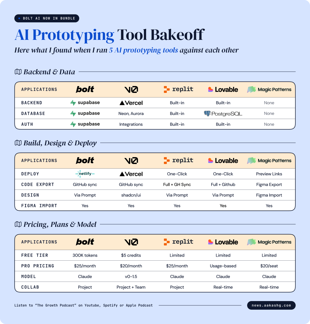
Clearly the big 4 right now are Bolt, v0, Lovable, and Replit. So I compared these 4 as they sit today.
The Feature Comparison
Here’s how the 4 tools compare across every dimension that matters for PMs. I verified each cell against current product pages and public data as of May 2026.
Best for, in one line
Bolt - Speed and full-stack iteration. The all-rounder.
v0 - Front-end polish, especially if your team already deploys on Vercel.
Lovable - Non-technical PMs who want a finished page, not a code editor.
Replit - Internal tools with persistent data. The only one with a real built-in database and auth.
The Bakeoff
If there’s one takeaway from the features comparison, it’s this:
I ran the same feature through each. Here’s what happened.
The Prompt
I built a PM portfolio page: hero section with name and tagline, career highlights as metric cards, a skills section, and a contact area. This is relevant to PMs (portfolio content is one of my most-read topics), visually rich enough to show design quality differences, and simple enough that all 5 tools can handle it.
The exact prompt used:
Test 1: AI conversational search for Yelp’s homepage
Type: feature add to a familiar consumer product. Tests AI-aware UI patterns, branded restraint, edge cases on a high-traffic surface.
Yelp’s homepage is a passive listings grid with a basic keyword search bar. Internal research shows 67% of dinner-decision queries are multi-constraint (”date night under $50 with patio, not too loud”) but the current search bar only handles a keyword and a location. Users either give up or open three other tabs to compare. The fix is conversational search, shipped into the existing homepage without redesigning anything else.
We’re adding AI-powered conversational search to Yelp’s homepage. The rest of the homepage stays exactly as-is: the existing nav, the For You grid below the search bar, the curated category strip, the footer. You’re shipping ONE new feature into an existing page, not redesigning Yelp.
Current state: a basic search bar at the top of the homepage with two inputs (what + near). Users type “ramen” and “94110” and get a static results page. Average session has 2.3 searches before the user finds something or gives up.
Build the new search experience:
The search bar sits where the current one does, full width below the nav. Single input field, not two. Placeholder rotates every 3 seconds through real conversational queries like “Best ramen open right now”, “Date night under $50 with patio”, “Coffee shops with strong wifi nearby.” The bar has a subtle sparkle icon on the right edge so users understand this isn’t keyword search.
On focus, the bar expands into a chat-style interface that overlays the top of the page (the For You grid behind it dims to 40% opacity). As the user types, show three suggested completions based on prior queries from similar users.
On submit, stream the AI response. A short paragraph of natural language reasoning, followed by 3-5 restaurant cards stacked vertically. Each card shows the photo, name, price/distance/rating, and ONE pulled-out reason why it matches the query (”Open until 11pm, patio confirmed, average bill $42”).
The user can refine in plain English. A follow-up input below the results says “Refine your search...” with example prompts like “Closer to me” / “Anything cheaper” / “Vegetarian options.” Refinements re-rank the same surface, not navigate away.
The search overlay can be dismissed with Escape or a close button. When dismissed, the For You grid restores to full opacity. The user’s last query persists in the bar in case they want to resume.
Design constraints: keep Yelp red (
#D32323) only on the active search state and the close button. The chat surface uses a clean light card with subtle shadow, not a full modal. Mobile takes the full screen instead of an overlay. Tap targets minimum 44px.Edge cases: if the AI returns no matches, show 3 alternative search suggestions (”Try expanding distance” / “Try removing ‘open now’”) rather than an empty state. If the user types a non-restaurant query (”buy a couch”), redirect gracefully: “Yelp is best for places to eat, drink, and visit.” Loading state uses shimmer in card slots, not a generic spinner.
First Outputs
Here’s what each tool produced from the identical prompt:
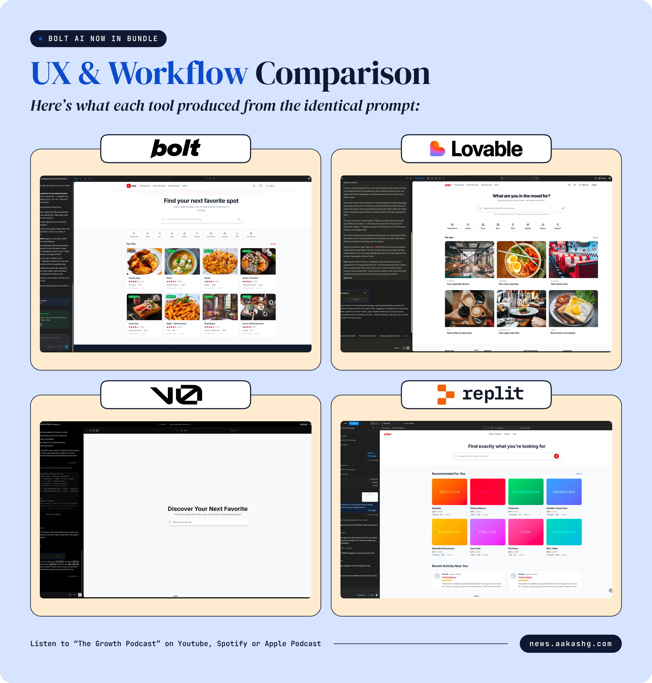
Bolt — 3 minutes
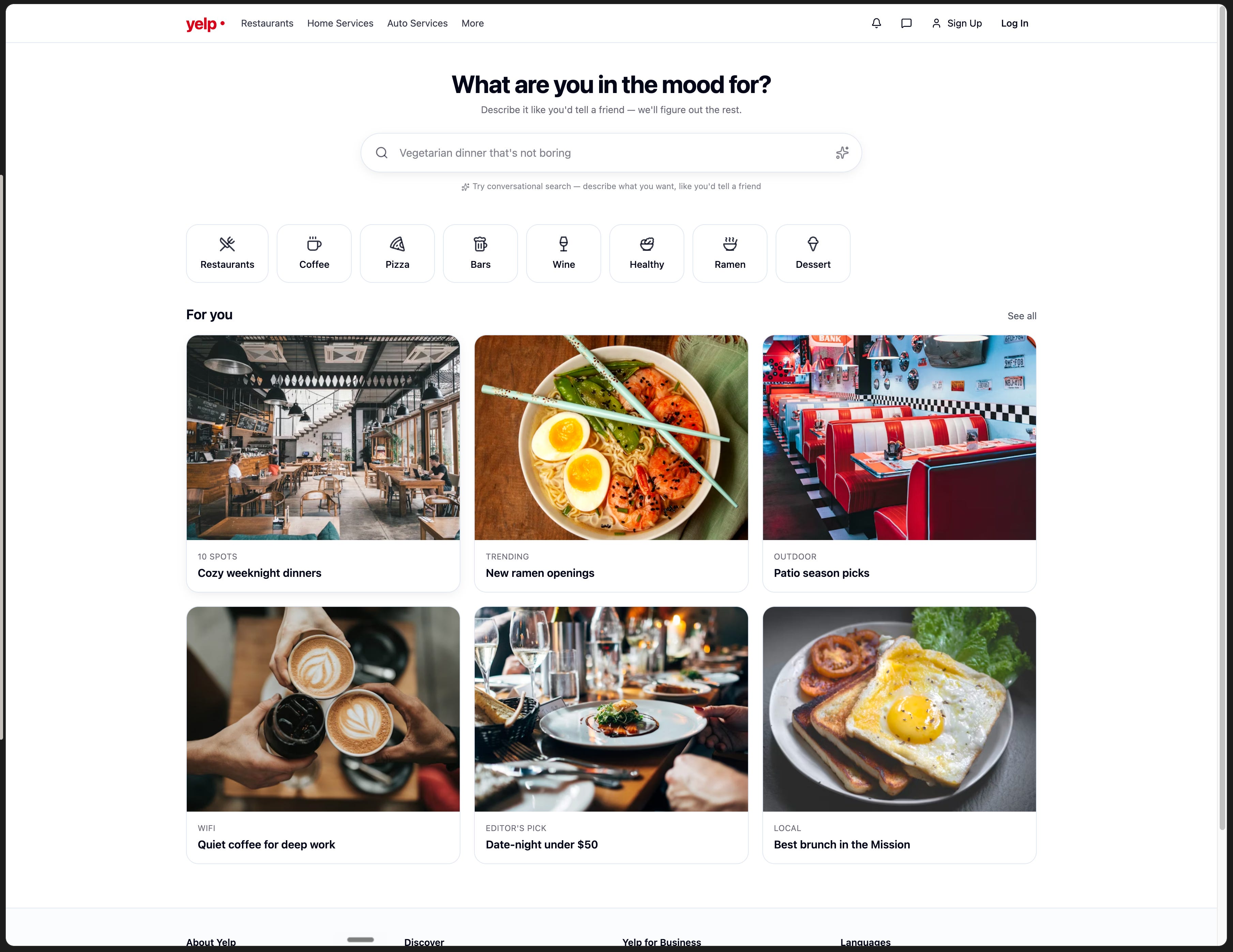
Bolt shipped fastest, beating v0 by 2 seconds and finishing a full minute ahead of Lovable and Replit. No questions asked, no clarification requested, just output.
What stood out: Bolt was the only tool that respected the Yelp brand. Real red logo, the actual nav (Restaurants, Home Services, Auto Services, More), red used only on the live “Open Now” badges. v0 didn’t show the brand at all. Replit modified it. Lovable softened it.
The most interesting move was unprompted. Most cards say “Verified,” but a couple say “Verify before going.” That’s the data-trust edge case from iteration 3 of my prompt, and Bolt baked it into V1 without being told. That’s the kind of inference you get from someone who reads the whole spec before opening Figma.
v0 — 3 minutes 2 seconds
v0 took the prompt’s “AI search as the centerpiece” so literally that the search IS the entire page. No nav, no logo, no For You grid, no categories. Just a headline, a subtitle, and a search bar floating in space.
Zero Yelp brand. No red, no logo, no nav. Swap “restaurants” for “products” in the copy and you could ship this as a search demo for any company. The placeholder was the weakest of the four: “Best sushi in the city...” where Bolt gave you rotating specifics like “Date night under $50 with patio.” Generic where specific would have helped.
Lovable — 4 minutes 3 sec
Lovable was slowest, and the output reads like it spent that time playing it safe.
The hero copy was the strongest of any output: “What are you in the mood for?” with “Describe it like you’d tell a friend, we’ll figure out the rest.” Warmer than anyone else got close to.
But Lovable collapsed two distinct sections the prompt explicitly separated. For You and the curated category strip became one section of 6 large editorial collection cards. No prices, no ratings, no “Open Now” anywhere. It looks like a magazine landing page. Wrong product surface.
Replit — 4 minutes
Replit took 33% longer than Bolt and shipped a duplicate-content bug. It added a “Recent Activity Near You” section nobody asked for, and the two reviews in it are literally the same review from “Alex M” about Tartine Bakery, pasted twice.
The one thing that worked: real San Francisco restaurant names in the cards (Nopalito, State Bird Provisions, Zuni Cafe, Kin Khao). The output felt like a real product, not a mockup. Then it modified the Yelp logo to “yelp+” and swapped the real nav for its own version (Write a Review, Events, Talk). The brand wasn’t in the prompt to redesign.
Iteration
Obviously as PMs, we shouldn’t ship first outputs. So, I gave each tool the same 3 follow-up prompts: a color scheme change, adding case study cards, and fixing mobile typography.
Iteration 1 (Group decision mode)
Our highest-frequency unsolved use case in user research is “I’m trying to pick a place for a group and everyone has different constraints.” We watched 14 users get stuck in this pattern, opening 4-6 tabs to cross-check. Add a group decision mode to the search.
In the chat overlay, add a “I’m with a group” toggle below the search input. When toggled on, the AI prompts the user to capture each person’s constraints in plain English. “Sarah is vegan, Alex is gluten-free, Maya wants under $40 a head.” The user can list 2-6 people. As they describe constraints, the AI summarizes them into a visible “Group profile” card above the search results so the user can see the AI captured everything correctly.
The recommendations that follow are constrained by the intersection of all preferences. Each card shows a small “Works for all 4” badge or, if it’s partial, “Works for 3 of 4 (Maya: closest to budget)” with the friction surfaced honestly.
Add a “Share group plan” CTA at the bottom of the results that generates a one-tap shareable link any group member can open without an account.
Edge case: if the group’s constraints have no intersection (vegan + steakhouse-only), the AI says so plainly and suggests the closest-fit places for each subgroup, not a fake compromise.
Iteration 2 (Conversational memory across sessions)
Returning user research shows 23% of users come back within 7 days to revisit a search they didn’t complete. Today they start over from scratch because the search has no memory. Add conversational memory across sessions.
When a logged-in user opens the search bar, show a small “Pick up where you left off” pill above the placeholder if they have an unfinished search from the last 7 days. Tapping the pill restores the full prior conversation, results, and any refinements they applied.
The AI itself should reference past sessions when relevant in new searches. “Last week you looked at Saigon Deli but didn’t go. Want me to include similar places nearby?” Frame these as suggestions, never assumptions, and always with a “Forget this” link that clears the memory thread.
Add a small “Search history” link in the chat header that opens a sidebar with the last 30 days of conversational searches, each summarized in one line. Users can re-run any prior search with one tap, or delete it. History is per-account, never shared.
Edge case: incognito or signed-out sessions have no memory at all and surface no past-session pills. The first signed-in search after a long absence (over 30 days) should NOT reference old context. People’s tastes change.
Iteration 3 (Hardening for ambiguity and outdated data)
In a stress test of 500 random queries, the AI returned at least one closed-down restaurant in 31% of responses, and gave confidently wrong answers about hours, menus, and reservations in 18%. The hardening pass below is non-negotiable before this ships to GA.
Three changes:
Add a confidence indicator on every restaurant card. Green dot if the AI has verified data from the last 30 days (hours, menu, current price range). Yellow if the data is 30-90 days old. Gray with a “Data may be outdated” footnote if older. Never show data older than 180 days without an explicit “verify before going” prompt.
When the AI doesn’t know, say so. Never fabricate. If a user asks “Does this place do reservations?” and the AI doesn’t have signal, the response is “I don’t have reservation data for this place. Try calling or checking their site.” This is more important than appearing smart.
Add a “Report incorrect info” link on every card and chat response. Tapping it opens a quick form with one tap for common errors (closed, wrong hours, wrong price, wrong cuisine). Reports feed back into the data pipeline and the user’s home feed should show “Thanks, we updated this” within 48 hours of a verified correction.
Don’t change the happy path UI. This iteration is about what the system does when it doesn’t have a clean answer.
Final Results
Here’s how they handled it.
Bolt - Most production-ready output of the four.
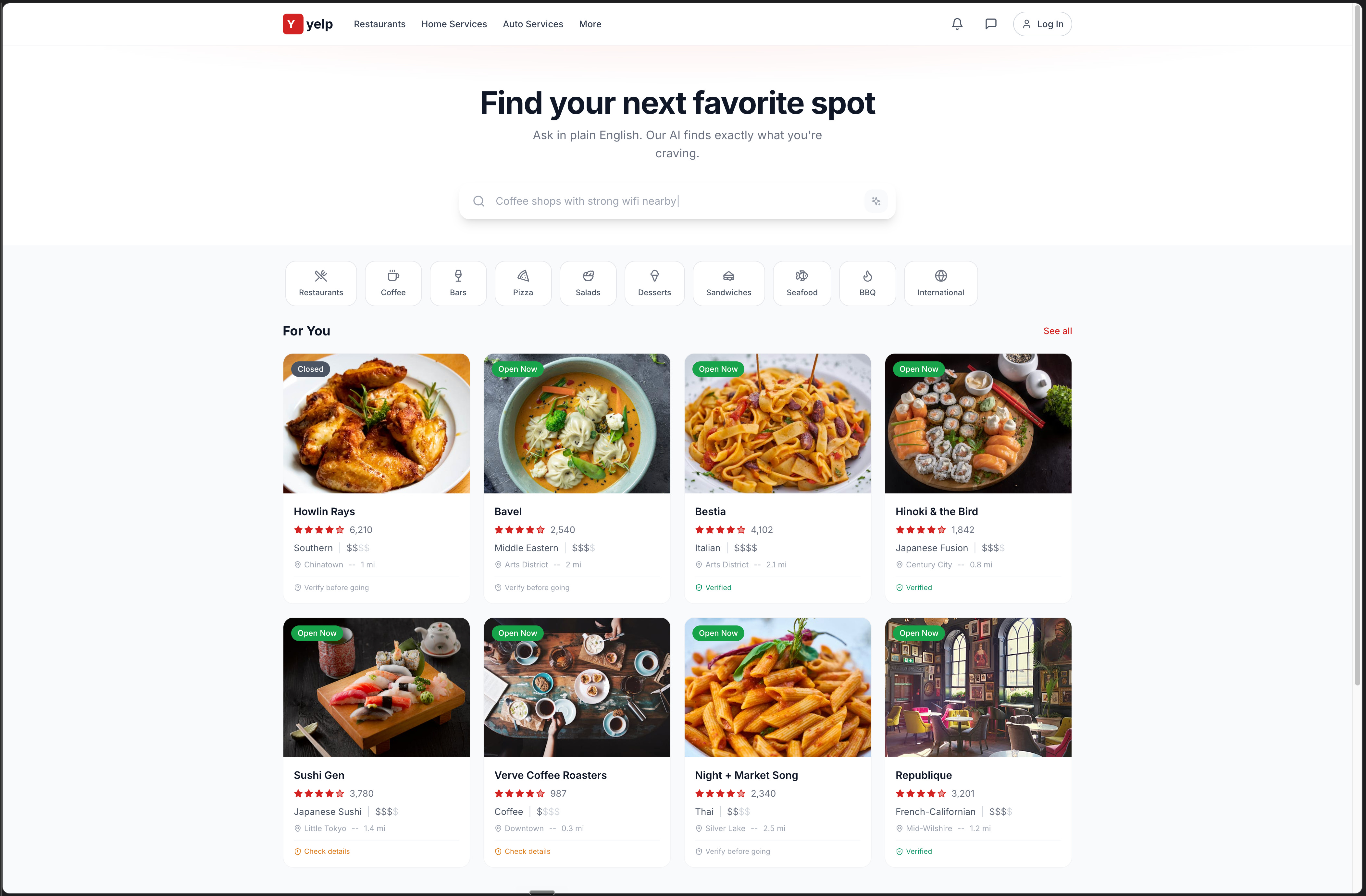
Yelp red used only on the logo and live “Open Now” badges. Everything else stays grayscale plus the food photography. The kind of brand restraint that usually takes a senior designer to enforce.
The hero copy is the strongest of the four: “Find your next favorite spot. Ask in plain English. Our AI finds exactly what you’re craving.” Specific enough to teach the user how to interact without resorting to “AI-powered” buzzwords. Sticky nav matches real Yelp exactly. Eight individual restaurant cards in a 2x4 grid with the full information set the prompt asked for: photo, status badge, name, rating, cuisine, price, distance.
And again, the unprompted touch from V1 survived all three iterations. Most cards say “Verified,” a couple say “Verify before going.” Bolt internalized the data-trust requirement and carried it through without drift.
v0 - Most minimal interpretation, almost to a fault.
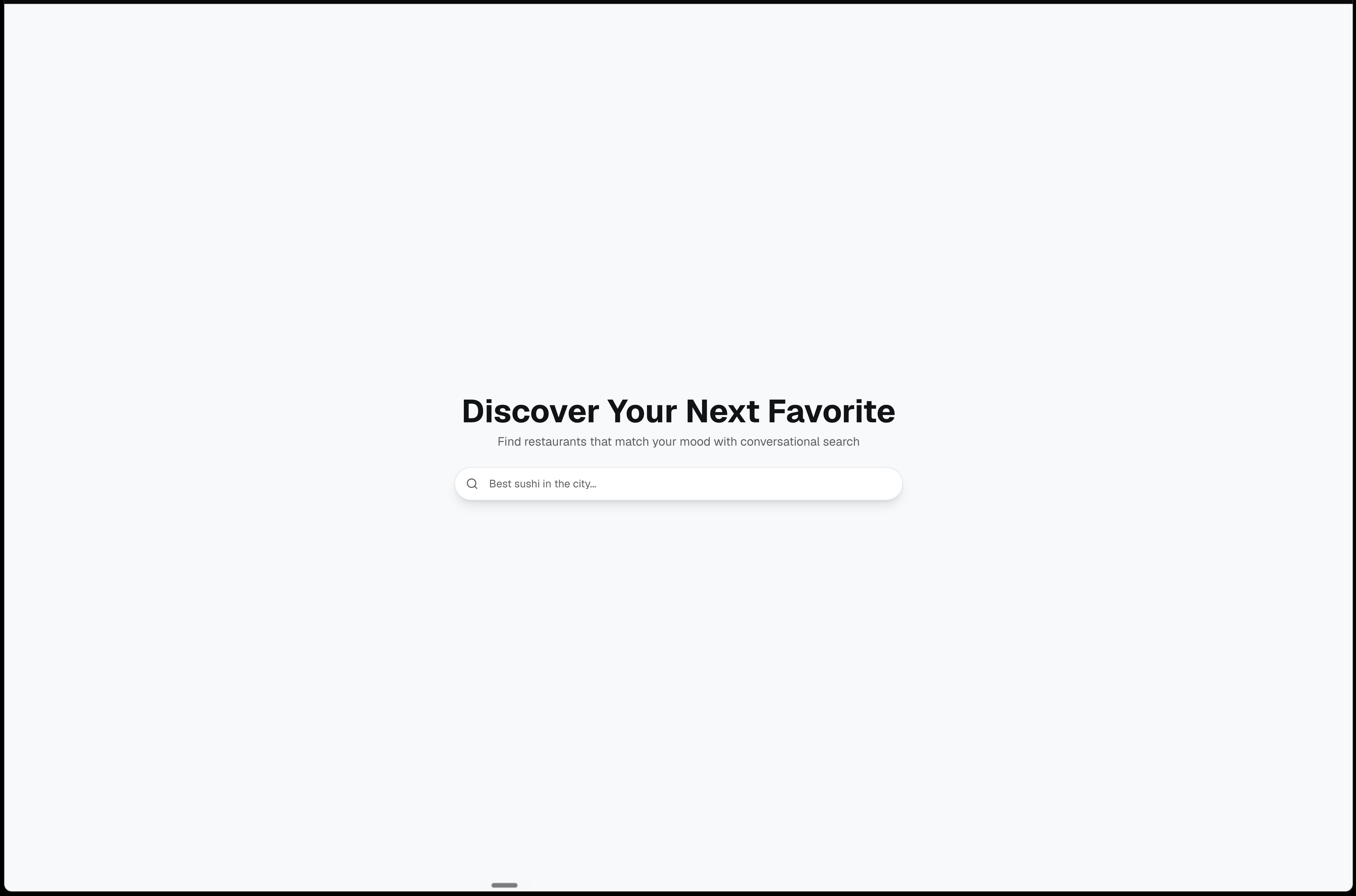
v0 kept the same problem through all three iterations. The search IS the entire page. No nav, no logo, no For You grid, no categories. A headline, a subtitle, and a search bar floating in space.
The hero copy stayed generic: “Discover Your Next Favorite” with “Find restaurants that match your mood with conversational search.” Could be any food app. The placeholder never improved either. “Best sushi in the city...” where Bolt is cycling through real multi-constraint queries. If you need a clean search component and plan to drop it into your own layout, v0 gives you that. If you need a prototype that looks like the actual product, it doesn’t get there.
Lovable - Strong editorial choice, wrong product surface.
Lovable’s hero copy remained the warmest: “What are you in the mood for?” with “Describe it like you’d tell a friend, we’ll figure out the rest.” The placeholder was concrete and on-brief: “Late-night bites after 11pm.” Lifted straight from real user behavior.
The structural problem persisted. The For You restaurant grid and the curated category strip stayed collapsed into six editorial collection cards (Cozy weeknight dinners, Quiet coffee for deep work, Date-night under $50). No individual restaurant data anywhere on the page. No prices, no ratings, no distance, no “Open Now.” Beautiful output, wrong product.
Replit - The most opinionated swings, some off-brief.
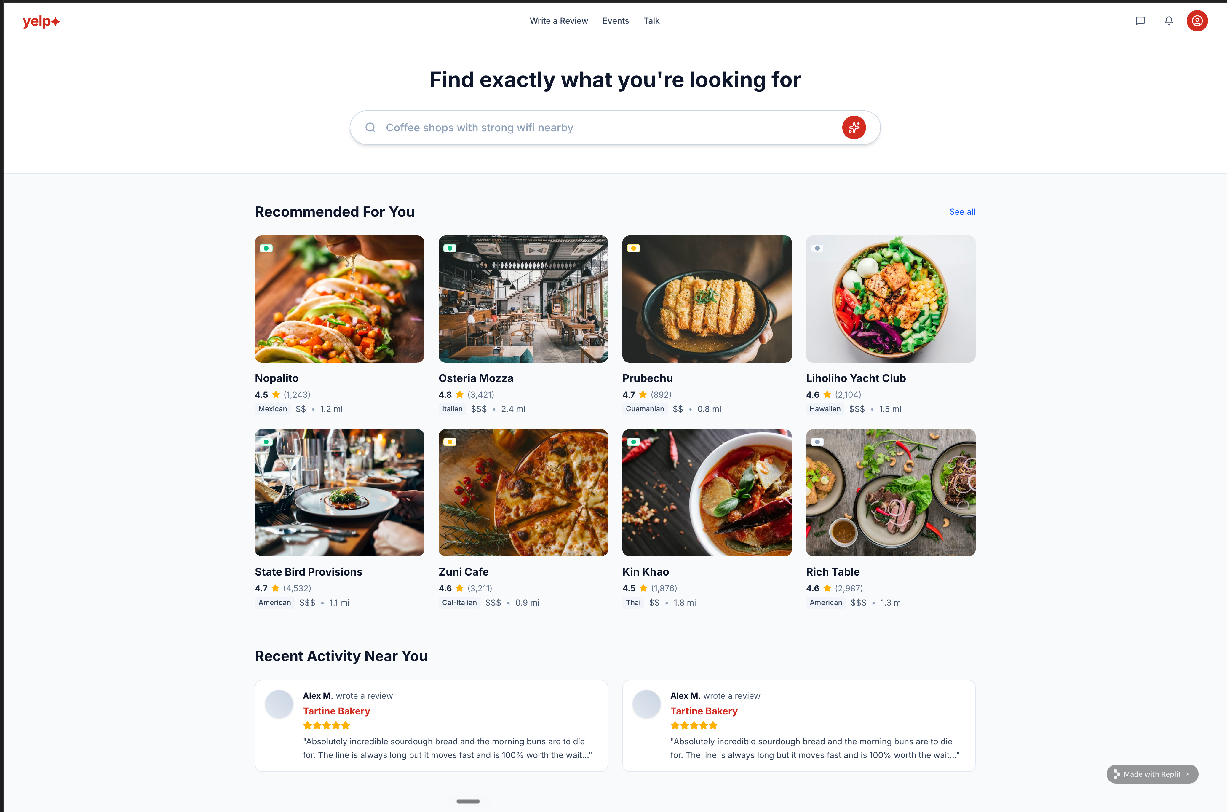
The real restaurant names held up. Nopalito, State Bird Provisions, Zuni Cafe, Kin Khao still made the output feel like something you’d actually ship.
Everything else stayed off-brief. The “yelp+” logo modification persisted. The custom nav (Write a Review, Events, Talk) replaced the real one. The duplicate “Alex M” Tartine Bakery review was still there after three iterations of follow-up prompts. The brand mods, nav restructure, and duplicate review together push it out of “ship-ready” territory. (The specific mistake pattern that causes bugs like this to persist across iterations is one of the 5 mistakes I cover below.)
Bolt wins, and this wasn’t scripted. In fact, this wasn’t the only test I ran. I actually ran all these tools through a PM portfolio. You can find all those results here:
There again, Bolt won. That’s why I worked so hard to get Bolt into the bundle; be sure to grab it. And yes: I would’ve published the results even if Bolt didn’t win.
Where we go from here
That’s the bakeoff. Now the question is how to actually use these tools well. I spent a year interviewing the builders. What they taught me everything that follows.
🔒 For paid subscribers:
5 expert workflows from Sachin Rekhi, Boris Cherny, Colin Matthews, Dan Olsen, and Nadav Abrahami, each sourced from their podcast appearances
The decision framework: 7 situations mapped to the right workflow + tool combination
The 5 mistakes I made building landpmjob.com (and that Dan, Sachin, and Nadav each named independently)
My personal setup and the production bridge
Downloadable AI Prototyping Skill file with before/after demo
Keep reading with a 7-day free trial
Subscribe to Product Growth to keep reading this post and get 7 days of free access to the full post archives.