Check out the conversation on Apple, Spotify and YouTube.
Brought to you by:
Vanta: Automate compliance, manage risk, and prove trust
Kameleoon: Leading AI experimentation platform
The AI PM Certificate: Get $550 off with ‘AAKASH550C7’
The AI Evals Course for PMs: Get $1155 off with code ‘ag-evals’
Today’s Episode
The biggest innovation gap in AI right now is the interface.
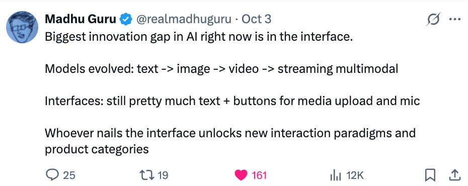
Most people are just sprinkling AI on top like fairy dust. Adding chat interfaces to everything. Ignoring 70 years of design principles.
Elizabeth Laraki was one of 4 designers on Google Search in 2006. One of 2 designers on Google Maps in 2007. She helped create products used by billions: products whose designs barely changed for 15+ years because they nailed it from the start.
Today, she breaks down exactly how to design AI features that users actually love.
P.S. Want me to coach you to your dream job? I’m coaching a group of 30 Nov-Jan. Join us.
Your Newsletter Subscriber Bonus
For subscribers, each episode I also write up a newsletter version of the podcast, as a thank you for having me in your inbox.
Today’s complete guide covers:
How AI Design Is Different
The Three-Step Process for Any AI Feature
Designing Beyond Chat: The Next Generation
1. How AI Design Is Different
1a. The Core Process Hasn’t Changed
Elizabeth’s three-phase framework from Google still works today:
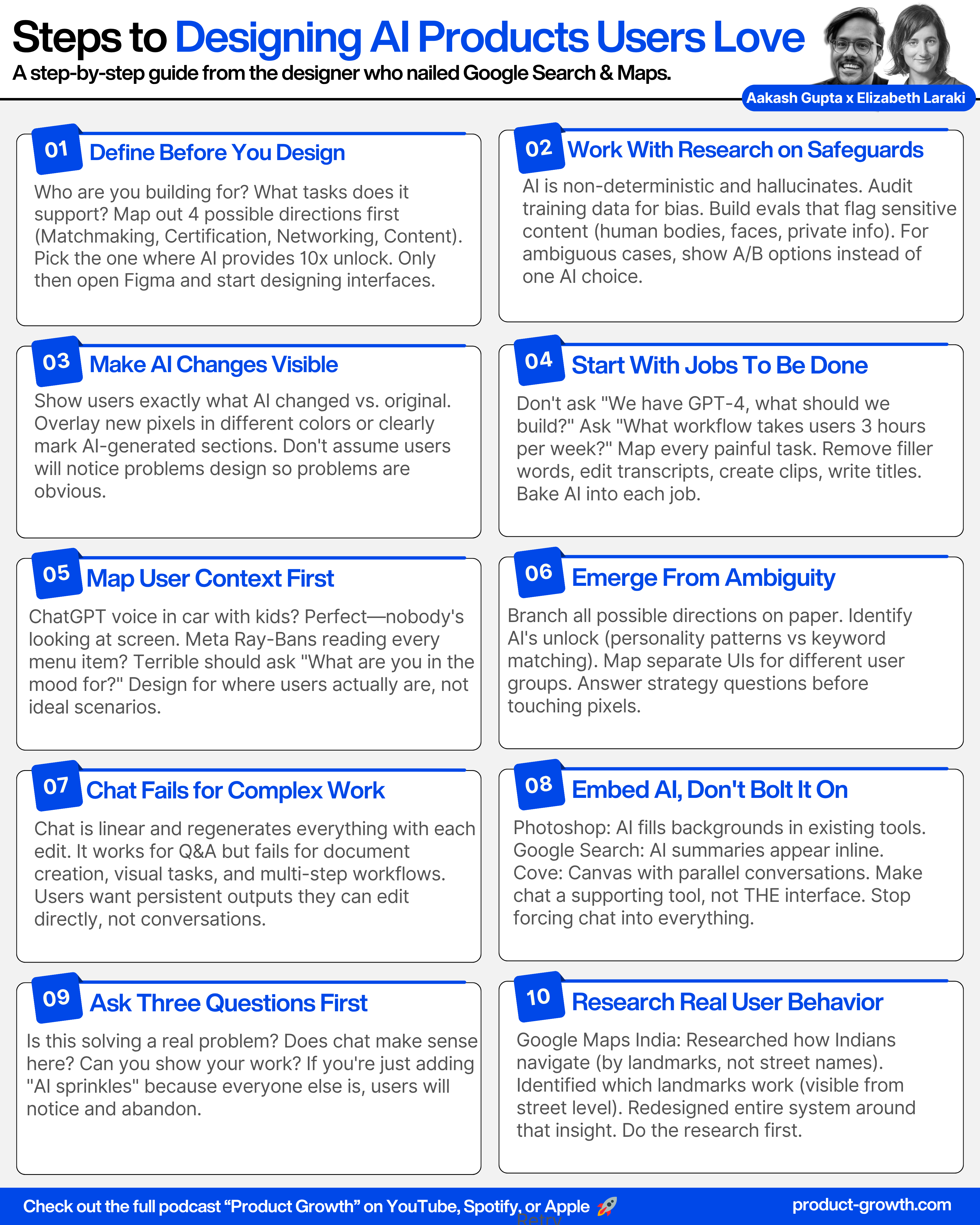
Define the Product: Who are you building for? What tasks does it support? Be specific, not “everyone” and “everything.” Classic Discovery.
Design It: What features do you need? How do they work together? What’s the information architecture?
Build It: What are the most intuitive UIs? How does it carry your brand?
Only after that would she touch pixels.
1b. AI Adds Non-Deterministic Risk

Traditional software is deterministic. Click A, get B every time. AI is non-deterministic: same input, different outputs.
Elizabeth sent her headshot to an AI conference. They cropped it square, then used an AI expander tool for social media. Result? The AI added a visible bra strap that wasn’t in the original.
Completely unintentional workflow. Completely unacceptable output.
1c. Design for Human-in-the-Loop

So, for AI features touching real people or sensitive content, design mandatory human checkpoints. Make it obvious what AI changed so users can scrutinize it.
“When interacting with real people or any hybrid AI-people mix, there needs to be additional scrutiny.”
2. The Three-Step Process for Any AI Feature
2a. Start With Jobs To Be Done
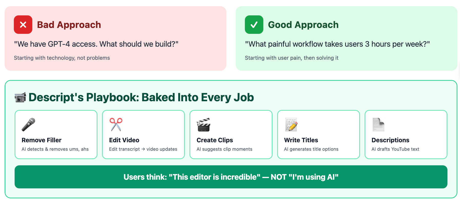
Don’t ask “We have GPT-4, what should we build?” Ask “What painful workflow takes users 3 hours per week?”
Descript mapped the entire video editing lifecycle: Remove ums/ahs → Edit from transcript → Create clips → Write titles → YouTube descriptions. They baked AI into each job.
Users don’t think “I’m using AI.” They think “this editor is incredible.”
2b. Map User Context, Not Just Needs

Let’s consider two different examples.
First, ChatGPT voice in Elizabeth’s car: Three kids asking questions, nobody looking at the screen, rapid-fire interruptions. The UI didn’t matter it was designed for that exact context.
Second, Meta Ray-Bans reading a Spanish menu: Started at the top, read every item like a screen reader. Terrible. Should have asked “What are you in the mood for?” then read selectively.
Same AI. Different context. The lesson: design for where users actually are, not an ideal desk scenario.
2c. Emerge from Ambiguity First
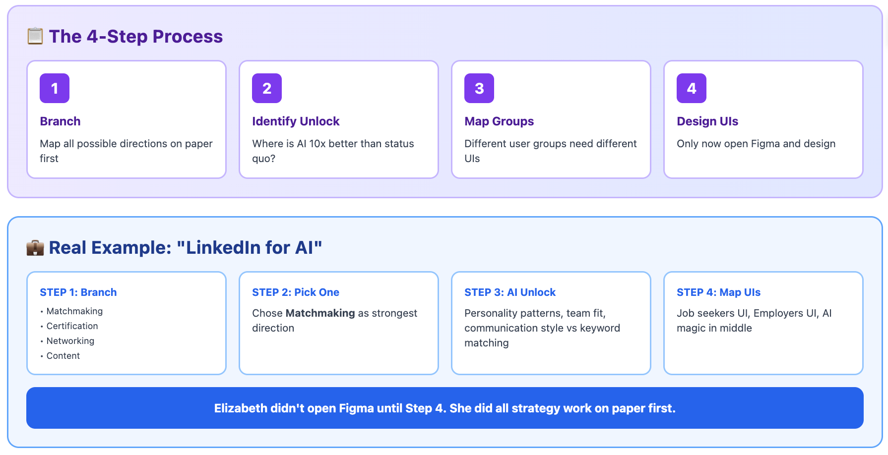
Elizabeth’s meta-framework: “Emerge from ambiguity with a clear sense of what you’re building, for whom, and what it does in the world.”
For “LinkedIn for AI,” she branched possibilities first, picked Matchmaking, then asked: What can AI see that keyword matching can’t? Personality patterns, team fit, communication style.
Then mapped the marketplace: Job seekers need one UI, employers another, AI magic in between.
3. Designing Beyond Chat: The Next Generation
3a. Chat’s Fundamental Limitation
Chat is linear. This limits what it can do well.
Elizabeth tried creating a Madrid itinerary in ChatGPT. Every time she changed one thing, it regenerated everything with new hallucinations. What she wanted: A Word doc she could edit directly, with AI helping her co-create it.
Chat works for Q&A. It fails for document creation, visual tasks, multi-step workflows, or anything needing persistent editable output.
3b. Make Chat a Supporting Tool
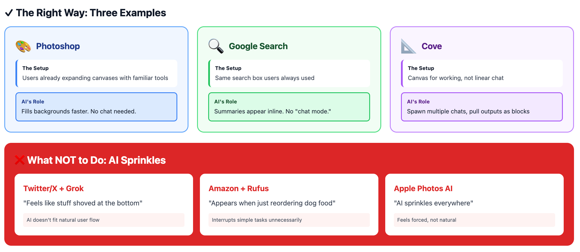
Chat is a tool, not the interface. Get inspired by these examples instead:
Photoshop: You’re already expanding canvases. AI just fills backgrounds faster. The interface stays familiar no chat needed.
Google Search: AI summaries appear inline in normal search results. You’re not “entering chat mode.”
Cove (from Google Street View founders): Instead of linear chat, users get a canvas. They can spawn multiple AI conversations in parallel, pull outputs as blocks, and combine them.
3c. Three Questions Before Adding AI
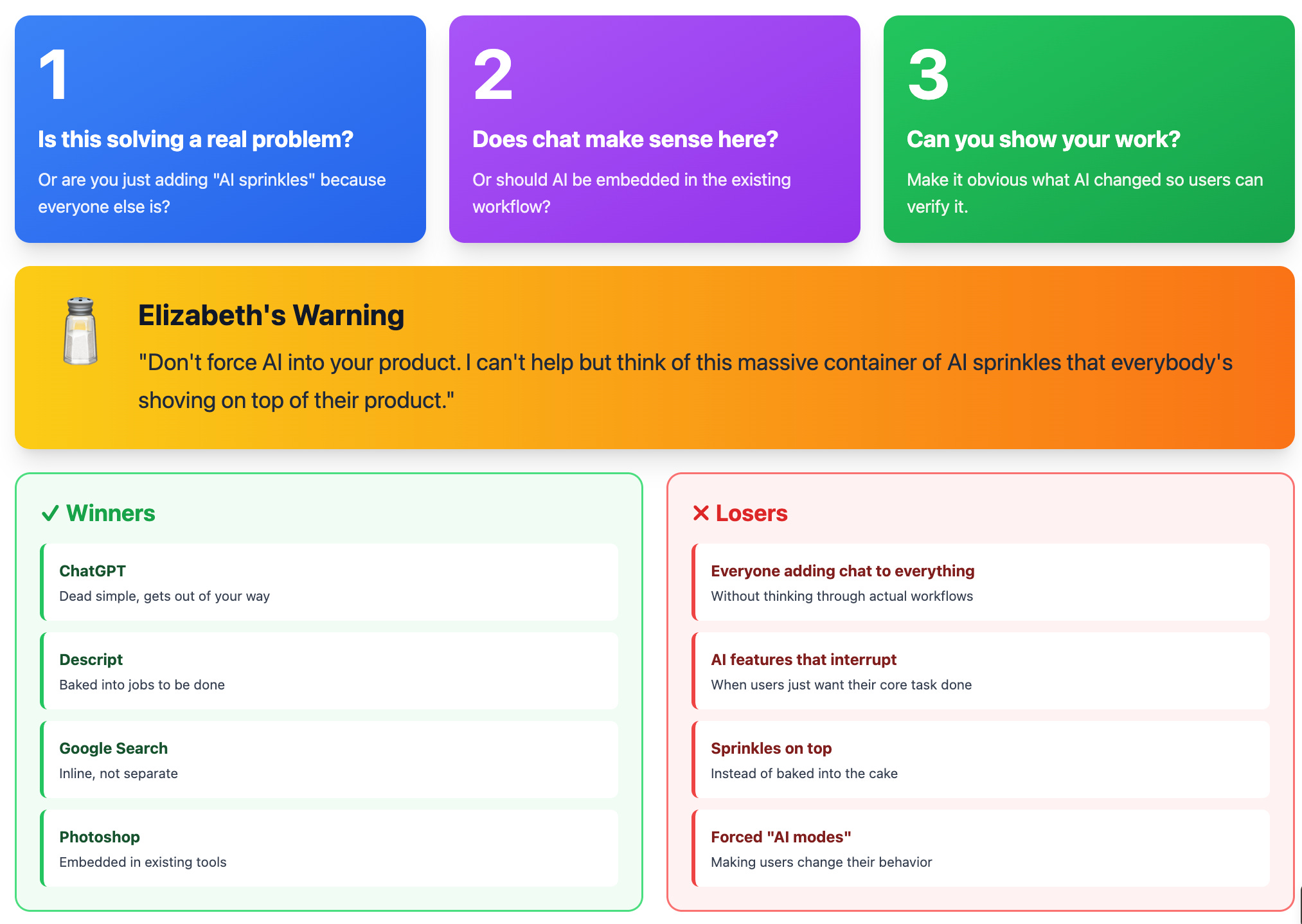
“Don’t force AI into your product. It’s like everyone has a massive container of AI sprinkles they’re shoving on top.”
Before adding AI, ask:
Is this solving a real problem? Or just AI for AI’s sake?
Does chat make sense? Or should AI be embedded in existing workflow?
Can you show your work? Make it obvious what AI changed.
Google Search did it right AI answers your question inline, no separate flow.
Key Takeaways
We’ve also started a clips channel. Please give it some love and subscribe.
Where to Find Elizabeth Laraki
Related Content
Podcasts:
Newsletters:
P.S. More than 85% of you aren’t subscribed yet. If you can subscribe on YouTube, follow on Apple & Spotify, my commitment to you is that we’ll continue making this content better.