
How to Optimize Your Information Architecture
Deconstructing Product's Latest Buzzword
In Today’s Newsletter:
Canva is More Impressive Than You Think
🔒 How to Optimize Your Information Architecture
Canva is More Impressive Than You Think
Did you know that Canva has been profitable for the last 6 years? No wonder it’s valued at more than $40B. (That’s double what Adobe acquired Figma for.)
Here’s how Canva has managed to build a profitable SaaS business that’s still growing at scale (>100% growth at >$1B ARR):

Strategy 1: Perfecting the Product-Led Growth (PLG) motion
There’s something about Australian companies and PLG. Atlassian, Afterpay, Linktree… the Australians like the model. Canva is PLG as well. But Canva does it in its own way:
It does it for the design market
It has a massive free MAU - far more than the others
Its marketplace is a core conversion lever that actually works
Each detail of Canva’s PLG motion - from freemium vs paid functionality, to pricing page, to feature gates - is best-in-class.
Strategy 2: Investing in Innovation and Quality
Canva ships fast. It’s constantly using the latest tech like AI is to power its smart design tools, such as Magic Resize, Background Remover, Content Planner, and more. I love its generative AI features like Magic Design:

Canva also maintains a high standard of quality and performance across its platform. Its designs look great on any device. There’s few companies with Canva’s consistent quality.
Strategy 3: Hiring Steadily With Growth
The crazy thing (for a tech company) about focusing on profitability is: you hire more steadily.
In the boom time of 2021, Canva stayed disciplined with its hiring. So it never had to do layoff and shock the culture. Instead, throughout the recent tech downturn, it was able to continue hiring some of the best talent that was laid off.
This has only helped it increase its leg up. Now, Canva has over 125 million monthly active users.
This is the just the tip of the iceberg. In a few weeks, I’ll be sharing my 6,000 word treatment on Canva’s history and product strategy.
ICYMI - My Other writing:
Careers: Great execution, holistic leadership
Thank you for making my book the #1 new release in job interviewing! 🙌
How to Optimize Your Information Architecture
For this week’s deep-dive, we’re digging into the latest buzzword in product management: Information Architecture (IA).
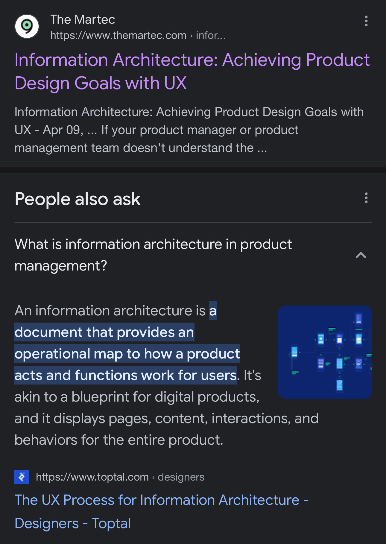
Information architecture is a well-understood concept in User Experience (UX) circles, but it’s a new concept for product people. What even is Information Architecture, you may be asking?
A quick Google search for “information architecture” and “product management” only emphasizes the gap. There’s no content:
Maybe it doesn’t matter, right?
But - these days, every other company you look at has an Information Architecture product team. Google, Meta, Netflix, Airbnb…
So it really is something you ought to know more about. As a result, this week, I went super deep. I deconstruct IA over 6,000 words in 7 parts:
What is IA
The IA of 4 top apps
When to build an IA team
How to build an IA team
Common roadmap items
How to measure impact
Pitfalls of IA PM
1. What is IA and what do IA teams work on?
According to The Information Architecture Institute:
Information architecture is the practice of deciding how to arrange the parts of something to be understandable.
But this definition isn’t quite precise enough to differentiate IA from Design Systems (DS), which I wrote about a few weeks back.
Let’s go the layer deeper. IA and DS focus on different areas but can intersect at times.
Information Architecture: refers to the structural design of shared information environments. It involves organizing and labeling websites, online communities, and software to support usability and findability. The goal is to help users find information and complete tasks.
Key artifacts that an engineer working on information architecture might focus on include:
Site Maps: A visual representation of the website's structure.
Wireframes: The blueprint of a webpage that outlines its structure and layout.
User Flow Diagrams: Representations of the path a user would take to complete a task.
Taxonomies: Categorization of information.
Metadata: Data about data, helping to make information findable and manageable.
Design Systems: refers to a collection of standards, components, and principles along with the tools to achieve those standards. It includes reusable components and a set of standards guiding the use of those components. This can help to create consistency and efficiency in product development.
Key artifacts that an engineer working on design systems might focus on include:
Component Libraries: A repository of reusable UI components.
Style Guides: Documentation of the visual design language like typography, colors, etc.
Pattern Libraries: A collection of design patterns for common interfaces.
Documentation: Detailed guidelines on how to use the above elements.
Design Tokens: These are the visual atoms of the design system — like colors, font, whitespace, etc.
When we talk about the role of a Product Manager in these two areas, their responsibilities differ based on the focus area:
A Product Manager on Information Architecture would typically work on defining the structure and organization of the product or website. They would need to understand the user's needs and behavior to create an intuitive structure that meets those needs. They might work closely with UX designers, content strategists, and developers to ensure the IA supports the overall user experience.
A Product Manager on Design Systems, on the other hand, would work on creating, maintaining, and enforcing the design system across the organization. They would collaborate with designers and developers to ensure the components and patterns are usable, accessible, and effective. They'd work on managing and evolving the system as the product scales.
So that’s the difference between IA and design systems. Now that we have that out of the way, let’s learn from the Information Architecture for 4 top apps.
2. The Information Architecture of 4 Top Apps
To break it down, we’ll deconstruct 2 of the best B2C and B2B apps out there.
B2C: Slack, Airbnb
B2B: Salesforce, Zendesk
We’ll dive into the degree of familiarity you need to have as a PM/founder. Your designer, of course, will be able to delve 10x deeper than what we’re about to explore.
Slack (Yes it monetizes via B2B)
Let’s take a look at a typical Slack page.
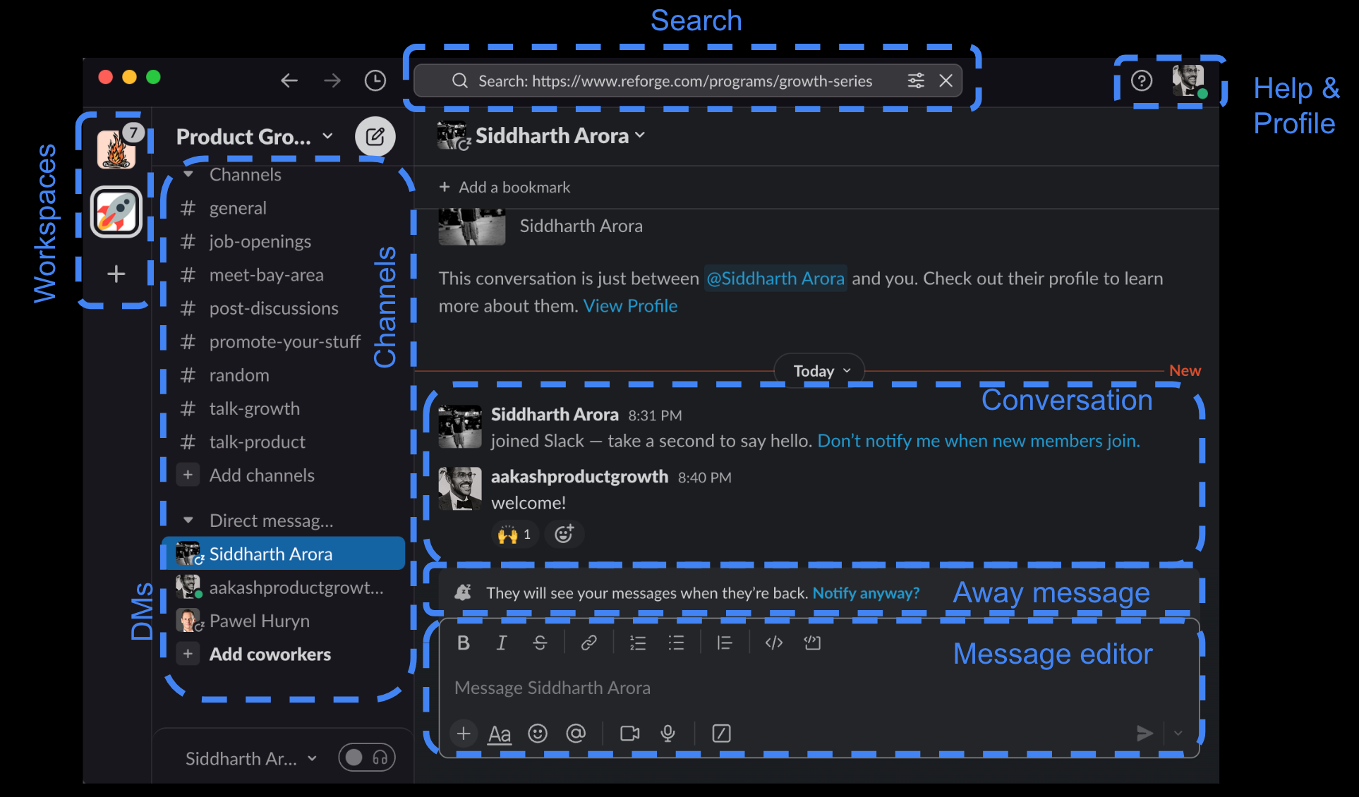
Even a “simple” and “magical” product like Slack has so many elements! I start with this example to bust the myth the great information architecture is simple right off the bat. The software we tend to interact with these days, even in B2C, is not simple.
But it is designed for usability. While the Slack page has lots of things, we can basically break it up onto three major categories of elements:
The biggest part: the conversation and message editor
The channels and workspaces to the left of that
The search, help & profiles at the top
That’s the magic of great information architecture: it’s about sectioning up the page and giving focus to what’s important. It’s not about presenting an empty screen.
Slack does this by not being totally space hungry in the chat interface. There’s plenty of blank space in the top right. This gives the entire page a feeling of “breath.” It also minimizes elements of the interface that are intuitive, like the help and profile in the top right.
This overall information architecture is something that slack borrowed from IRC and nailed from basically the start. The big additions over time have been workspaces, the away message, and other little complexities they tucked in over time.
That’s actually an important concept as well. Once your core product is widely used (Slack has >100M DAU), then you can slowly complexify it. Slack has done that brilliantly.
There’s much more to Slack’s information architecture, but for the sake of learning, we’re going to stick to the best parts.
Airbnb
Now, let’s hop over to another great example - Airbnb. It’s much more of a traditional product and has much more going on. So we’ll start with a page deep-dive like Slack, but we’ll also zoom out to take a look at the overall sitemap.
To start: the core Airbnb experience is the guest search. This is what gets the most traffic. So let’s hop in there.

Airbnb doesn’t go for the the full simplicity of making messaging the main real-estate like Slack, but it’s beautiful and spacious nonetheless.
One of the interesting things is that they’ve split the page in half. But they keep each half beautiful:
The Listings: Airbnb puts the best pictures of the Airbnbs first. This keeps people intrigued visually in the page. Airbnb goes from being a “utility” to a place to spend time.
The Map: A small detail that enhances spaciousness of the page is how much of the map versus tiny price bubbles you see. All the map area without bubbles gives it a feeling of space.
Other elements of Airbnb’s experience are more or less straightforward. We see the nav in the top center again (like Slack), the CTA for the host side of the business is in the top right, they specifically leave space for changing your language, and then they have settings and profile.
Airbnb is much more than guest search though. That’s the just the left bottom most path if you create a map of the entire architecture of information Airbnb provides:

Airbnb does a fantastic job designing every element of this experience. As a product & design team, they go through the most problematic elements of this experience and create simplified experiences for each use case - all enabled by the great navigation through the experience.
Can you do the same in B2B IA? In B2B, you’re usually doing a lot more for user.
Let’s take a look at two of the most well-tested IAs in the game: Salesforce and Zendesk 👇
Keep reading with a 7-day free trial
Subscribe to Product Growth to keep reading this post and get 7 days of free access to the full post archives.