Ultimate Guide: Pricing Pages
The highest impact growth product surface
Your pricing page is almost always the second most visited page on your website after the homepage.
It’s one of the highest impact growth product surfaces out there.
I’ve worked on my share of pricing pages: ScoutForce, Rap to Beats, thredUP, Google Hire, Fortnite, Affirm, and Apollo.
For this post, I also audited 100 more pricing pages as they are in January 2024. Now, I’ll distill the results of those findings.
We’ll skip all the basics and go straight to the depth.
The Plan
I wanted to create the resource you share with your PM friend who works on pricing - and the resource they bookmark before starting a new job.
This is our roadmap:
Breaking down 6 of the top pricing pages
The top experiments from my career
The encyclopedia of product levers
Framework to evaluate changes
Principles for pricing pages
Most common mistakes
Prototype page
1. Breaking Down 6 of the Top Pricing Pages
We’re going to take a close look at 6 of the hottest companies in tech’s pricing pages:
B2B: Figma, Stripe, Monday
B2C: Apple iPhone, Fortnite, Netflix
B2B Example 1 - Figma
Figma is a great example for the now-ubiquitous “seat based pricing model.”
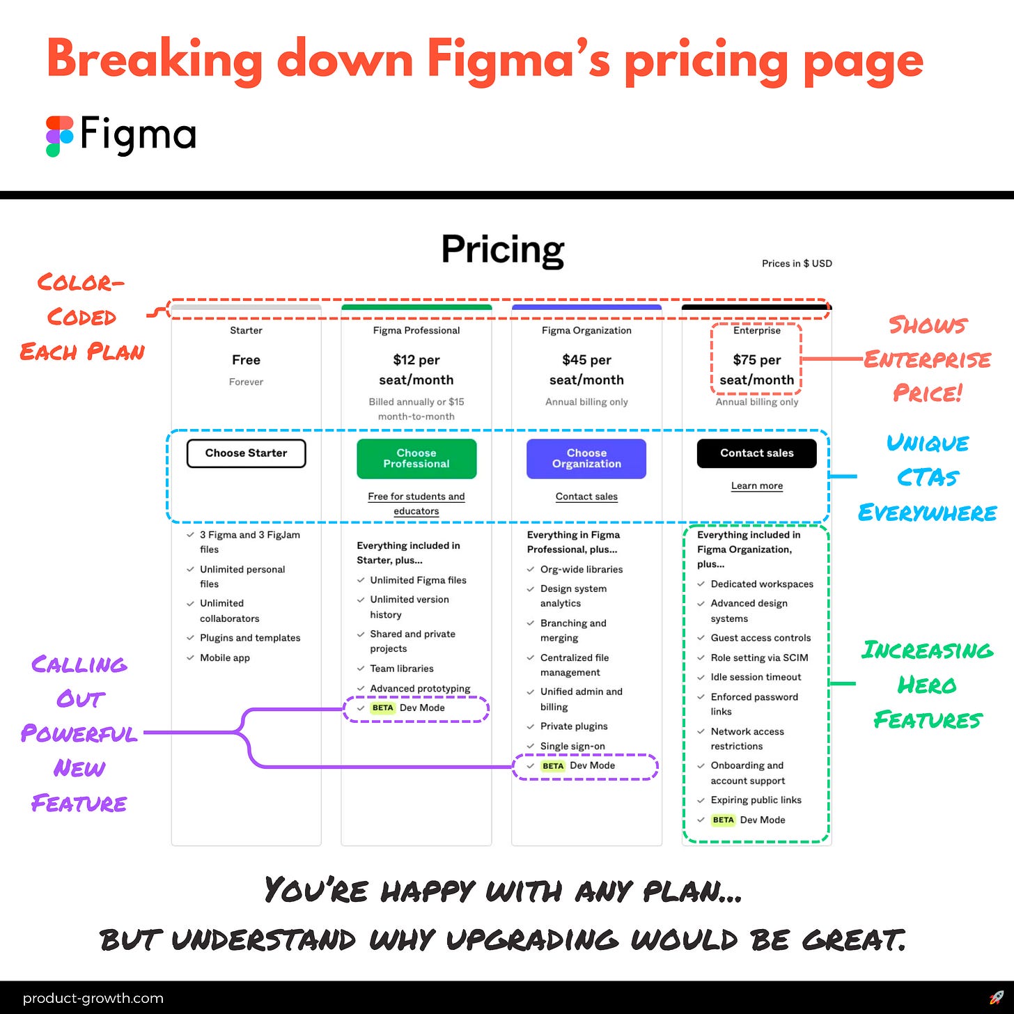
It’s definitely one of my favorite pricing pages in all of SaaS:
One of the first things you’ll notice is the color schemes for each plan. The page is simple enough that you actually notice:
Grey for free
Green for professional
Purple for organization
Black for enterprise
On top of that, each plan has a unique CTA:
Choose Starter
Choose Professional
Choose Organization
Contact sales
Each plan also has an increasing number of hero features:
5 for Starter
6 for Professional
8 for Organization
10 for Enterprise
I’ve actually tested those numbers of features - and that’s exactly what performs best.
Because this page fits perfectly “above the fold” on most desktop screens.
One of the most unique things about Figma compared to most in its category is it actually shows the price of their enterprise plan.
It doesn’t allow you to self-serve purchase it (more on that later). You still have to contact sales. But at least you know the price.
Overall, it’s a masterclass in pricing pages.
B2B Example 2 - Stripe
Stripe has a usage based pricing model, but it’s still absurdly easy to follow and reason about.
Stripe Element 1 - Above the Fold
This is the above the fold pricing at stripe.com/pricing:
Beautiful.
Of course - it helps to have simple pricing plans.
But even still - Stripe doesn’t bother you with tons of functionality.
It doesn’t have a giant table of everything that comes with that Standard pricing.
There’s just two options - standard and custom. Each is concisely explained and has a single CTA.
Stripe Element 2 - Feature Cards
Stripe has multiple sections to its pricing page. This is the second section:
In this section, Stripe actually gets to selling itself. It explains 32 of the features organized into 8 sections.
This is where people who are ready to explore what Stripe offers get their first taste.
Stripe Element 3 - Details by Product
Then Stripe has a long scroll for the third section of the page:
This is where Stripe goes into all the add-ons and other products in its suite.
And it explains all the additional pricing terms.
It has a really nice clear three column structure for you to understand the product, the details, and the price.
Overall, Stripe’s pricing page is a beautiful example of prioritizing simplicity and action at the top, and adding details below.
B2B Example 3 - Monday
Monday.com is a rocketship. Growing at 93% with $400M ARR is no small feat.
It’s done so with multiple products.
But its pricing page is still next-level simple - and optimized.
Monday Element 1 - Selector
It starts with the simple product selector:
Each product afterwards has a really cleanly explained 5 tiers.
Monday Element 2 - Hero Summary
Let’s look more at work management, which has a seat-based model:
It continues the Figma best practice of increasing hero features per page. Good start.
It also adds in interesting ‘watch why standard’ and ‘watch why pro’ CTAs beneath the ‘Try for free’ main CTAs in two plans. Those are short 1 minute videos that succinctly explain what makes that plan unique.
That’s smart when you have lots of options.
Like almost everyone else these days, Monday also defaults to a yearly subscription. But what it does particularly well is it shows the percentage savings specifically: 18%. Stating these numbers specifically tends to perform better.
They also use tooltips over each feature, which is a really strong practice that worked well for me.
Monday Element 3 - Exhaustive Comparison Table
Below the pricing, Monday has your full comparison table:
This is really visual so its easy to read. Some comparison tables look like spreadsheets and your eyes glaze over.
Monday makes it relatively easy to understand what you’re getting.
Monday Element 4 - FAQs
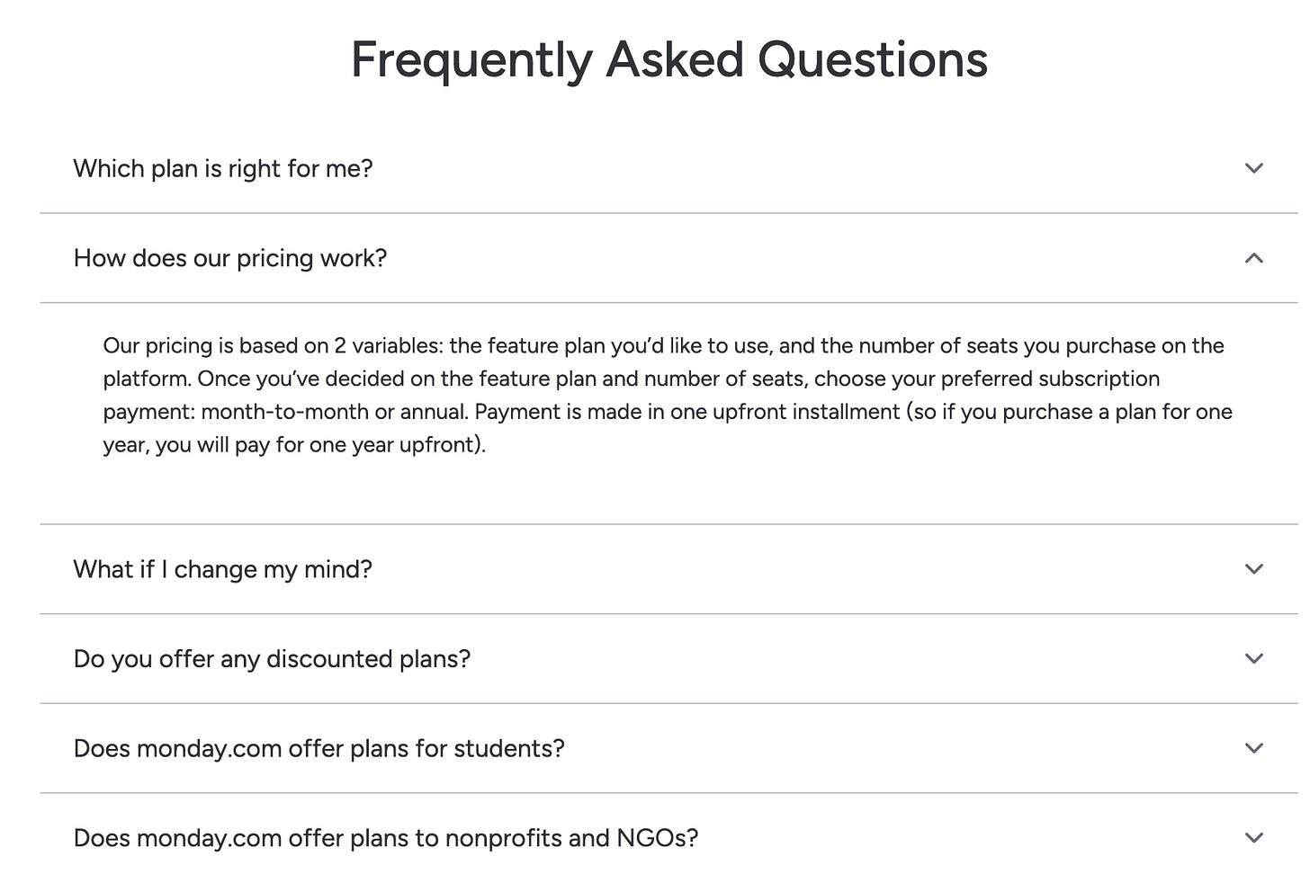
Finally, Monday ends its pricing page with the FAQs:
This four-part structure (selector - hero - table - FAQs) is the one that I’ve seen work most effectively for multi-product companies.
FAQs are the final place to hit people who read that far to get them with content that might lead to a conversion.
Overall, Monday hits all the best-practice for B2B.
With over 5,000 words and 30 images, this post was too long for e-mail:
Now, let’s move onto B2C. Things change.
B2C Example 1 - Apple iPhone
The iPhone is one of the world’s largest consumer products.
But there’s so many versions these days.
Apple shares the price in three steps.
iPhone Element 1 - Phone Selector
Apple now has 5 different types of iPhones you can buy - plus accessories, so they feature the most expensive version in a hero slot:
This is a bold focus on the single highest-priced product and its differentiator: titanium.
Apple knows each upgrade cycle needs a big reason to upgrade, so they focus on theirs.
Most companies would want to list every last reason: 1.25x the battery life, 10% better processor, and the rest.
Apple keeps it exceedingly simple.
The one thing they do have is the trade-in program featured prominently.
This is smart. It’s objection handling.
They’re addressing the elephant in the room: you already have an older iPhone, and this new one is expensive.
iPhone Element 2 - Type Selector
If you choose iPhone 15 Pro, then Apple takes you to choose which size.
Again, it’s helping you objection handle.
Why do I need a max?
Well, because it’s bigger when fitting in your hand.
Apple helps you with your choice with a clear reference picture.
iPhone Element 3 - Storage Choice
After having you choose your color, you finally land on your price:
Apple assumes you know what you want at that point. But, just in case, it includes a video to help you decide.
What’s interesting is how much emphasis Apple is placing on its monthly purchase program.
It’s just like all the SaaS products we say.
Monthly figures are more digestible since they’re smaller.
Focusing on them increases conversions.
Overall, Apple reminds us how powerful it is to lead with simplicity and one main message.
B2C Example 2 - Fortnite
Fresh off its victory against Google, interest in my former employer is increasing.
So let’s explore how Fortnite handles its pricing.
Element 1 - Buy V-Bucks
There’s absolutely no explanation:
We would rather users have a really simple choice where they see the discounting for buying more at once.
This continues our Apple trend of going dead-simple.
In B2C, it’s always simpler.
Element 2 - Item Detail Page
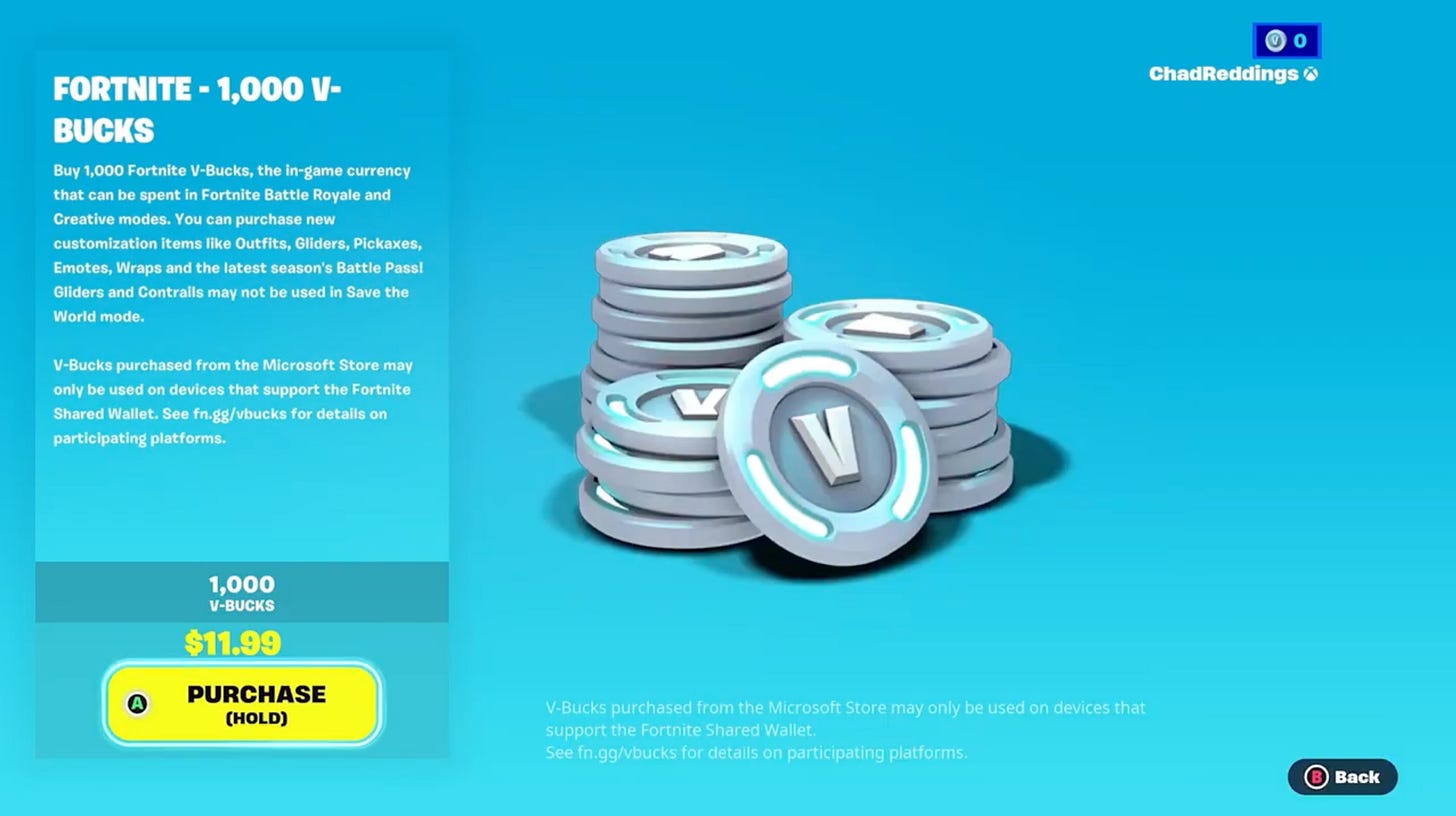
All the detailed information is after you click the item:
Even then, it’s not really selling you on the v-bucks.
It’s just a bunch of legalese to ‘confirm’ the purchase.
Element 3 - Update Counter in Shop
The real selling of V-bucks is done in the shop, which as you’ll see in the top nav, comes far to the left of purchasing v-bucks:
Fortnite has a different pricing page mechanic than every other example here: it is a continuous purchase product.
People will buy v-bucks multiple times in a week.
As a result, the entire flow is optimized for repeat behavior instead of new behavior.
If someone really needs help purchasing, they can find a UGC content video on it.
It’s a dramatic departure from all the pricing motions we’ve seen so far, which is why I wanted to include it.
This pricing motion generates billions of dollars a year.
If you’re worrying too much about stuffing more into your pricing page to get hundreds of thousands of dollars, remember Fortnite.
I always do.
You want to focus all the attention on the core delivery of value and then get out of the way.
B2C Example 3 - Netflix
Netflix isn’t the same boring old flat pricing company it was in the past.
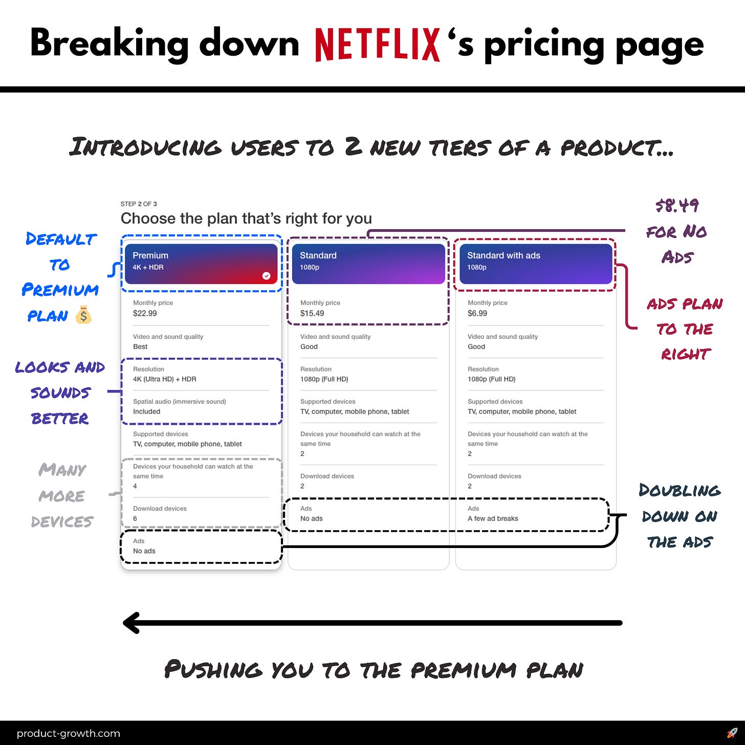
This is the latest Netflix pricing page:
Netflix is our final example because it flips the script and is pushing users to the most premium option.
You see something similar in luxury clothing stores where the most expensive items get the window slot.
Netflix has defaulted to the most expensive plan, and used just about every dimension of the table to emphasize that choice is the best one:
It has a much better color schema
Lots of bullets on why that plan is best
That plan is default and on the left, not the right
With news of Netflix having over 22M subscribers in its ads plan, it’s clear that plan over to the left is no slouch.
Netflix understands: price sensitivity is everything.
So Netflix still makes it interesting. The video quality is ‘good’ and you get 2 devices.
But the premium plans have far more unique selling points (USPs).
That’s it for examples. We’ll come back and summarize the principles from all our work in section 5. We need some more information first.
2. The top experiments from my career
These are the top 7 impact pricing page optimizations me or my teams have specifically tried.
Each one generated A/B stat sig positive results:
Keep reading with a 7-day free trial
Subscribe to Product Growth to keep reading this post and get 7 days of free access to the full post archives.


